Can somebody please point me to where these graphs come from? I’d be thrilled to see the actual data/studies behind that, it would be extremely useful.
*Hat tip http://austro-libertarian.com/ *
From each according to his ability, to each according to his greed.
Greed, for lack of a better word, is good. – Gordon Gecko

House Minority Leader Lawrence F. Cafero Jr., R-Norwalk, far right, speaks while colleagues play solitaire on their computers as the House convenes to vote on a new budget for the fiscal year in the Capitol on Monday [AP Photo/Jessica Hill]

That’s awesome


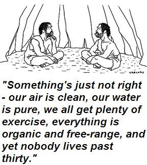
Hehe ^
Hahahahahaaahahahah!!