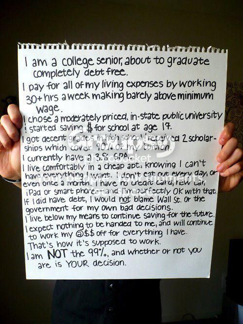
I didn’t actually see this on that 53% site…I’m pretty sure it has nothing to do with it, but I figured quite a few might like it…
That graph Share of Total Federal Tax Liabilities is very interesting. Does anyone have data on how much the top 1% (officially) pay?
I have got the figures for the UK and they are far more even. Top quintile pays 45%, then 23%, 16%, 9% and the bottom quintile pays 7%. If anyone wants to check this, the figures are on page 44 in The effects of taxes and benefits on household income, 2009/10.
So either the US is far more progressive than the UK, or taxes at the State level are much more even than the Federal level. Which is it?
If you follow that link in the graph (PDF), the top 1, 5, and 10 percent are broken out. In 1979 the top 1 percent paid 15.4% of all federal taxes. In 2006 it was 28.3%. The top 10 percent account for 55.4% of all federal taxes.
On another note I’m also going to yet again assume this means our no-face friend has no evidence to support his claim.
Which no-face man?
The one bickering about how more than 30-50% is taken away in taxes from families below the poverty line.
Taxing wealthy people faced a bigger attention during its blast and now that the bill is on hand, it brought a brighter shadow to US economy.I also read from this article After tax income for wealthiest one percent has tripled since 1979 the news about the tax of the wealthy which correpsonds on the tax plan. The after-tax revenue of the country’s wealthiest 1 percent tripled between the years 1979 and 2007. A brand new report from the Congressional Budget Office presented the results. The incomes of Americans in other tax brackets rose at a much slower rate. The report likely will give fuel to the Occupy Wall Street movement as well as the national debt-reduction debate. I hope, this would brought a brighter light to US economy.
I saw the Dailymail article but they did not provide a link to the source. It may be true but I would like to see the source. Anyways, I found some other statistics and info.
.
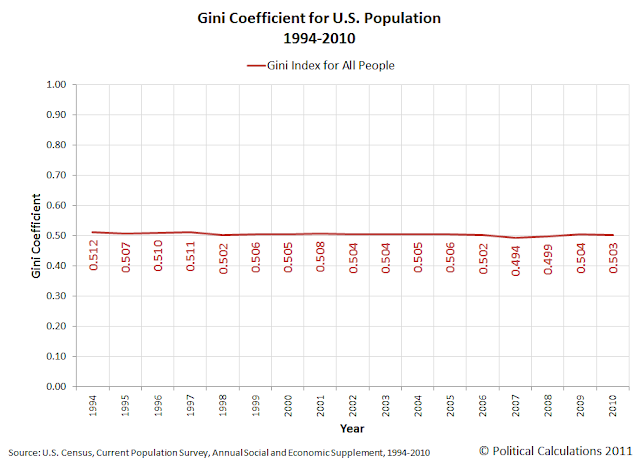
You can see from the graph above with the Gini coefficients (o=perfect equality, 1=perfect inequality), there was a gradual increase from the 60’s to the 90’s but from 1994 to 2010 it leveled off.
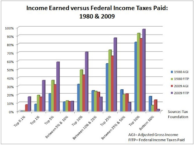
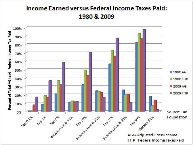
As for Federal taxes paid and the income share, I whipped up a graph for 1980 and 2009 (yes, I could have probably organized it a bit better).
I have much more info here.
That last graph is confusing. You certainly do not get the percentages by taking income and dividing by the taxes paid. So how do you do it?
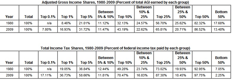
I appologize for the confusion. All I did was take the 1980 and 2009 figures from the charts below.
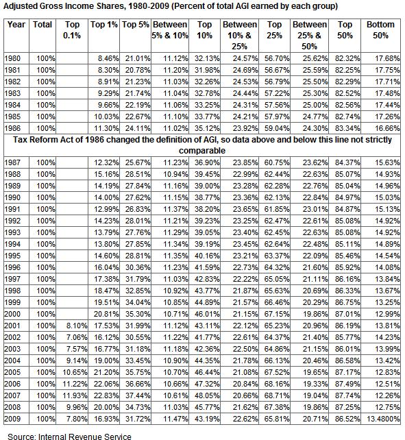
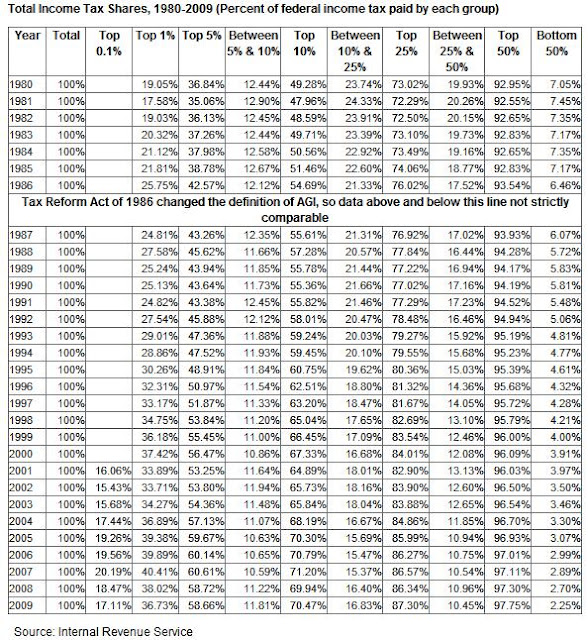
This following is what was graphed.
The first two bars in each column represent 1980 figures, the last two are 2009 figures. The percent figure on the Y-axis represents both the percent, based on group, of the amount of total income and total taxes paid in those years. Have any ideas on how to organize it better? I dont usually chart these things but I wanted to compare them.
Does anybody find it terribly ironic that these people are saying “I work my ass of and I’m still broke!”
Anyway:
He said he was an American, so it makes perfect sense that he was denied access to affordable medical care because of a legally enshrined trade union. It also makes sense that he was denied access to an all natural cancer treatment that has been proven to be effective, because he lives in the united states.