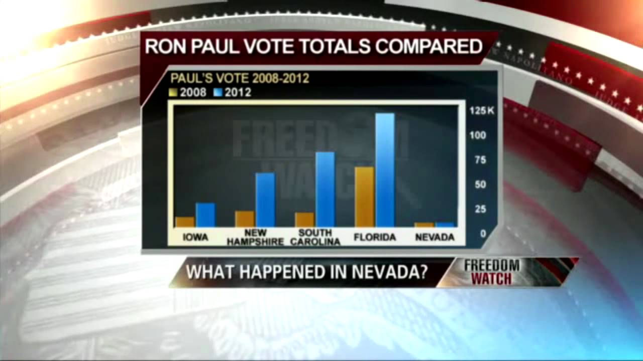
Now, being good Austrians, we should know that those graphs may show a correlation, but not necessarily a law and definitive proof. Evidence to consider, but not a 100% valid argument.
I’m suspicious of this whole process but this guy makes a decent attempt to argue why voting fraud didn’t take place in Nevada. He’s part of the Paul campaign in someway.
Thanks for the link. Just to clarify I am not saying voter fraud absolutely didn’t happen in Nevada, I’m saying there is no evidence of it, and it is absolutely not the reason Ron Paul lost.
The DailyPaul crowd is one thing, but this is the LvMI forums, let’s remain loyal to the intellectual standard set by Mises.
Displaying a bar graph of the the 2008/2012 Ron Paul votes and using it to suggest there was voter fraud is so absurd. It could mean many things, we should know this. But to put Nevada’s vote totals next to Florida is totally invalid.
In Florida there were over 1.2 million votes cast.
In Nevada there were 33,000.
See a problem?
Also, since we are comparing proportional changes from 2008-2012, why is there no mention of the fact total Nevada votes decreased by 25% from 2008 to 2012. And if the total pie goes down by 25% and our absolute number remains the same then…You know like inflation, we’ve gone over this stuff.
I saw a link of Nevada GOP chairwoman resigning in this thread too. She announced she was resigning Feb 5, 2012 (the day after caucus) over a month in advance. So again, trying to make Mises’ head explode with frustration and imply her resignation is “proof of voter fraud!” is really lame.
I made my blog post not to prove that voter fraud was impossible. I just stated the fact that there is no actual evidence of it, and the Ron Paul campaign assigned our loss in Nevada to extremely lower than expected supporter turnout. I go into more detail as to why on my blog.
But the #1 reason I wrote that blog post was to ensure we maintain our intellectual honesty and not sink to the level of our opponents. When I posted it on the dailypaul.com forum it got down voted like crazy. It appears I chose the wrong venue, I would think it would fit in much more nicely here at the LvMI forums. As this is where I learned that message.
a) The title just asks if there’s anything fishy. (Yes, I’m aware this largely implies foul play, but it’s not exactly making a claim of fraud and then purporting to use the chart as evidence. There’s a difference.)
b) If you follow the link, you’ll see it’s merely a repost from Lew Rockwell’s own personal blog.
c) I thought it was obvious the point of the chart was to show the differences between 2008/2012 in each individual state…not to compare totals of one state versus another.
Plus, if you want to play that game, total Florida votes decreased by 14.21%, yet Paul’s total increased by nearly 87% there…in a decidedly not libertarian state. (And on top of that, I don’t have to tell you he essentially didn’t even campaign there.)
Again…just aggregating posts from Ron Paul support world. This is a Nevada Caucus thread in a forum run by the non-profit founded and chaired by Lew Rockwell.
The first post you attacked here was a direct replication of a Lew Rockwell personal post. The GOP chairwoman is a link to a personal post of Robert Wenzel, advisory board member of RevolutionPAC, and as far as I know, at least friendly with Rockwell.
I realize I am responsible for my own actions in reposting their material, but not only are they the originators of the content, their sites get a lot more traffic than a single thread on the “old” Mises.org forum. You might take up your concerns with them.
I understand this, I have read your post and the comments, and I agree with you. I can appreciate the fact that you were there and you were involved, so I will take your word. I was not there. I appreciate your writing the blog and sharing your experience.
However, I am quite interested to hear your explanation of the other posts in this thread…In particular the chronology of the vote tally, and how you chalk up 24+ hours needed to tally <17,000 votes to simply “bad organization.”
I’m also interested to hear your take on the excess vote tallies. More “sloppiness”?
Again, I’m not saying this is proof of anything, but there comes a point when the aggregation of circumstantial evidence adds up to more than the sum of its parts. (And for more clarity, I’m not saying that point has necessarily been reached, but I have to agree with one of the commenters on your blog that you are being a bit dismissive. However I can understand why you may overcompensate so as to combat the DP types.)
Can’t waste too much more time on this. I wasn’t calling you out, I honestly just skimmed this thread in 10 seconds, I don’t even know your username or that you were the one posting all the objectionable sources.
I liked your extensive explanation of lew rockwell and the non-profit nature of mises.org that was kind of odd, but funny.
I am basically making a plea for my fellow stewards of the Misesian teachings to not indulge in crap that we would rightfully dismiss as nonsense if coming from the other side.
Like this: "c) I thought it was obvious the point of the chart was to show the differences between 2008/2012 in each individual state…not to compare totals of one state versus another. "
If that graph were used to suggest some conclusion you strongly disagreed with, boy I might think you’d have serious qualms with it.
Including the results of a 1.2M sample size and a 33k next to each other in the same graph that uses a Y-axis to display absolute vote totals, which Nevada is mathematically incapable of achieving, is fundamentally invalid and delibartely misleading.
Which is precisely why the data was presented in this way, and we all know it. That’s my main gripe.
I wasn’t. I just posted the specific ones you attacked.
The point of that explanation was to point out those posts (including the chart) are coming from the same source that essentially owns this forum.
That is not the way I saw it at all. I saw a bunch of low blue bars next to much higher red bars…except for one column where they were virtually the same height. That is what the chart was supposed to illustrate.
Again, Judge Napolitano showed the same chart on Freedom Watch to make that very point. (Which you would have seen had you bothered to actually read my post, which you obviously didn’t.)