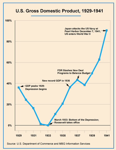
(The Y-Axis is GDP expressed as a percentage increase over the lowest GDP in 1933. Note that in 1929, the GDP is nearly 40% ABOVE the 1933 low, and this was surpassed in 1936)
putting aside questions of whether GDP is itself a good metric, the graph does not plot counterfactuals.
the graph does not show how the 20’s booom was caused by government intervention in the money supply.
it also doesnt show how if someone other than roosevelt, for example Mises had been head Benevolent dictator of the US and implemented free market policy that the GDP wouldnt have risen must faster, steeper, better from 1933 than the upwards slope that is plotted
The GDP includes government spending. So if you raise government spending, GDP will raise in the short run. The same with lowering government spending. All in all this graph doesn’t tell much.
I just have one question: Was government spending increased again in 1938?