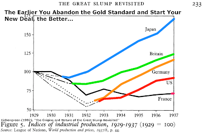
The above chart was posted at another forum by a fiat and socialism zealot. It came from a blog. It was in an article in the blog titled, Another Strike Against a Gold Standard. How do you interpret the chart?
Assuming “industrial production” is measured in terms of money, then one question is: Are the money numbers corrected for inflation, or not? If not, then how are we to know if actual production is increasing, or just the money numbers (reflecting continuously devaluing money), or a combination of the two?
After 1920 during the German hyper-inflation, I don’t think such a chart, measured in rapidly devaluing dollars Deutsche Marks Papiermarks, would tell us anything about the rate at which industrial production was changing.
Edit:
Also, the amendment “The Earlier You Abandon the Gold Standard and Start Your New Deal, the Better…” suggests that “increased industrial production” is somehow “better”…but, is this true? “Better” in what sense, and for whom? Was the increased industrial (war) production of World War II “better” for the civilians who had to suffer rationing, shortages, decreased selection, inferior quality goods, etc.?
If the data of the previous two decades were also included on that chart, all the post gold standard data of the Western nations on that chart would look quite poor.
In a similar note, Krugman recently tried to claim increased national debt causes economic growth by a tactic known as “strangling the data”:
“He supports his claim by looking at 5 countries and showing that the countries with higher debt levels grew faster over the last 3 months. Thousands of Krugman zombies must have been elated to finally see hard evidence that the 1% aren’t any smarter or harder working: All you have to do is take on a lot of credit card debt.”
“But an economic Jedi – an undergraduate from the University of Illinois – uncovered the subtle flaw in Krugman’s logic: The earth has more than 5 countries, and the world wasn’t created 3 months ago. The student used a graph posted on his Facebook page to show that if you look at the 21 largest countries over the past year, you see a strong, clear relationship: Economies with higher debt grow less. (By the way, the IMF agrees with the undergrad.)”