NOTE: Image was too large to post, so I just decided to post the direct link to said graph.
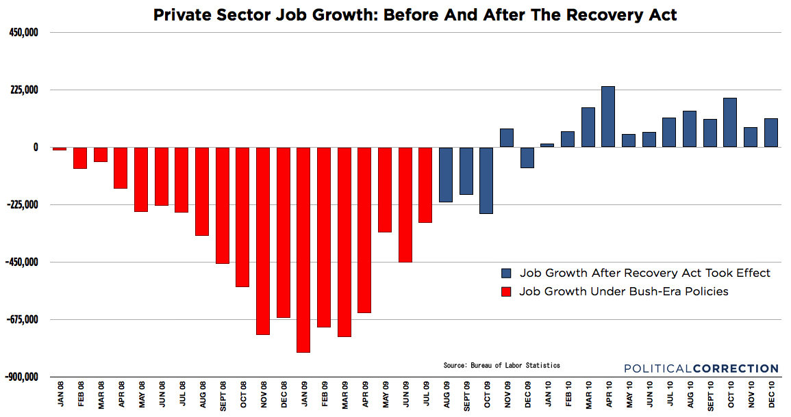
I have been seeing some Liberals spamming every Facebook page for the last few days with this graph. They don’t say anything other than vague sentences that suggest that Obama got people workign again.
However, when I look at the graph it doesn’t really tell me anything and doesn’t look all that impressive. So I thought I would ask the pros to tell me what I’m looking at or not seeing.