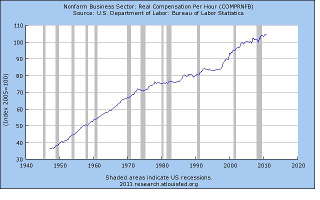
Recently leftists have begun to use these graphs as an argument against free markets, claiming this proves the curent crisis is directly caused by the pro-market measures in the 80’s.
What do you guys think about it?
Recently leftists have begun to use these graphs as an argument against free markets, claiming this proves the curent crisis is directly caused by the pro-market measures in the 80’s.
What do you guys think about it?
As a consequence, yes, the top 1% has lower wages in relation to the bottom 99%. But what’s the point?
Two-income households are also a lifestyle choice and influenced by the level of taxation and inflation.
The government has been actively encouraging the public to load themselves up with mortgage debt for decades. Deficit spending is hailed as the solution to all problems by Washington liberals. People do adapt, you know.
Interestingly, this piece does have an “average hourly compensation” graph that has not gained much more momentum than the “hourly wage” graph. The “real compensation” graph in my last post shows quite a different picture.
Does anyone know how Reich calculates his hourly compensation numbers in contrast to the St. Louis Fed’s way of doing it?
I think that charts are of no value without easily accessible methodology. How are they measuring each metric? Until that can be answered in detail they can’t support and we can’t verify any claim in those charts.
Until that can be answered in detail they can’t support and we can’t verify any claim in those charts.
Ah, dude, you can’t put that statement on a nice sign to hold up at Occupy Wall Street! We need flashy phrases that emphasize our anger, not some reasoned debate!