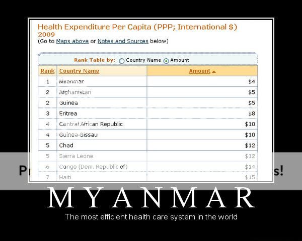
When debating healthcare with progs, you have probably seen this chart before.
“EAT THAT!” Say the proud Progs, having soundly crushed you.
If you’re like me, you’ve had to then slog through explaining that no, American healthcare as it presently is doesn’t work. But then they say “But then you have no examples to fight back with! I win! (insert evil cackle of your choice here)!”
But then, after diligent searching, I found this:
http://www.clearpictureonline.com/1960-US%20State%20Health.html
which shows American healthcare costs in 1960 (after many of the enforced problems of 1910 and the 1940s, but before the big mandates and Medicare) to be estimated at $2,952 when adjusted for inflation. Since it’s an estimation, let’s round that up to $3,000.
If you add the 1960 American cost of healthcare to that chart, it actually turns out to be the third cheapest listed, behind only Japan, Spain, and Italy. When you factor in the fact that almost all of those countries on the chart are currently undergoing massive debt crisis (especially those three), have incredibly high costs of living, and have comparably small amounts of disposable income, it’s pretty clear which is the more “civilized” system. Not to mention the fact that those countries also feature wait times, AND their healthcare is often paid for twice by first taxes to the government and then by private insurance to get decent quality.
If anyone is a good photoshopper, they could make an awesome image macro just by modifying the previous chart with the added information, ideally with a caption like “PROBLEM, PROGRESSIVES”