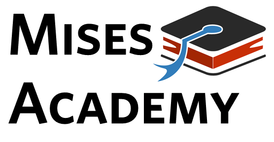
Any tips on improving? Ideas?
Uploaded with ImageShack.us
I like it, but I would almost like it more if it was like this
where the asterisk is the icon. That way the text can all be the same size (or close).
Uploaded with ImageShack.us
I am not an artist, and this is just a random font I chose to show you what I meant. I stuck the book on the right hand side, it might look better there.
Anyway, that’s all I got. Good luck and I hope you win the contest.
What about moving the hat/book thingy to the left side of MIses"?
Personally; I prefer it to the right…
I don’t know how you feel about this change, but I just made everything a bit more close together so it’s not as spread out.